Producing Accessible Art Experiences
Creative expression is integral to the human experience. Yet, many creative arts have barriers that prevent people with various disabilities from experiencing them. Globally, 43 million people have low-vision or blindness — and have been primarily deprived of experiencing the visual arts.

The Backstory
I along with Writer and Communications Professional Deanna Geneva Lorianni are seeking ways for people with low-vision and blindness to experience photography and poetry. We believe that the arts are too integrated into the fabric of society and culture to have accessibility barriers. Through this process, we are discovering how new universal and inclusive design methods could emerge by eliminating barriers to experiencing various forms of art.
Deanna and I have collaborated on many projects, most notably The Awareness Campaign, a multimedia campaign that advocated for disability rights and inclusion. We have long-standing careers in the design and communication industries that we are passionate about and sustain us. Our separate creative practices go beyond producing branding, marketing, and communication solutions. In addition to my work as a designer for the last 24 years, I continued developing a portfolio of fine art photography. Producing photographs is a vital part of my design process as it puts me in a state of play, exploring visual concepts and the fundamental principles of design. Deanna is a communication strategist, writer, and trainer, as well as a creative writer of multiple mediums, such as poetry. Her poems challenge her to work with language in engaging, thought-provoking ways to tell narratives and convey ideas and concepts about the human experience.
Since most photography and poetry are not accessible, Deanna and I saw an opportunity to apply our creative and professional skills to effect positive change within the disability community. Our goal is to create art that is accessible to all audiences.
I received a grant from the University of Minnesota Duluth to start a project that enables Deanna and me to create a solution that enables anyone, regardless of their sight abilities, to experience photography and poetry. After comprehensive research about low-vision and blindness and conducting multiple brainstorming sessions, we decided to produce a tactile book that provides multisensory experiences for people to interact with our photographs and poems. We call this book, Now / Between.
Since initating the project, Deanna and I have presented our journey of producing the book at international disability conferences. We were accepted to speak at those conferences through a peer-reviewed process. Our 2021 presentation at the 6th annual World Disability and Rehabilitation Conference was recorded and posted online.
The Approach and Challenge
Print and Disability Partners
Deanna and I are collaborating with Worth Higgins and Associates, a high-end commercial printer with the expertise and technology to print various solutions. They agreed to partner with us to produce the book because it tests their expertise and technology. We have been working with them throughout the process to determine which book formats and print techniques will meet our accessibility objectives. They will be printing the book once we get to that stage of the process.
We are also receiving consultation from the Lighthouse for Vital Living, a nonprofit that provides coaching, training, and occupational therapy for people with vision disabilities. Their staff members have been offering their expertise regarding accessibility for people with low vision or who are blind. They believe this book is groundbreaking in providing access to the printed word and images.
Through several meetings with Worth Higgins and the Lighthouse, Deanna and I identified vital components of a multisensory book experience that overcomes relying on sight:
Photographs
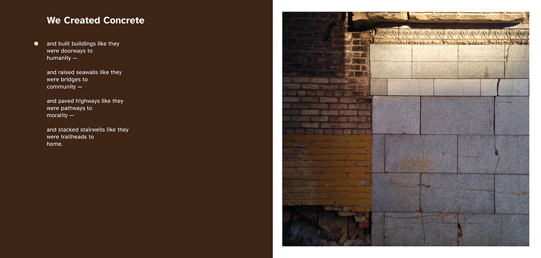
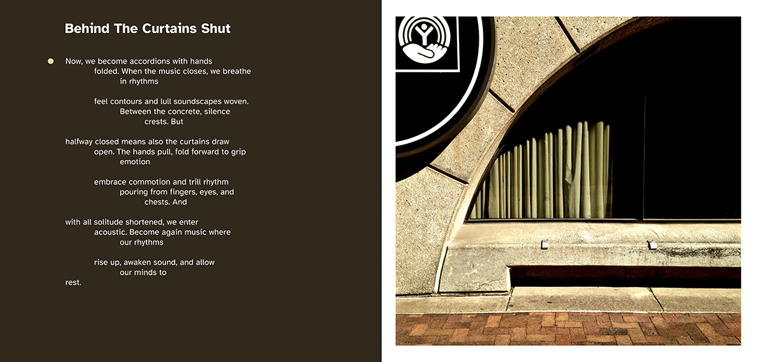
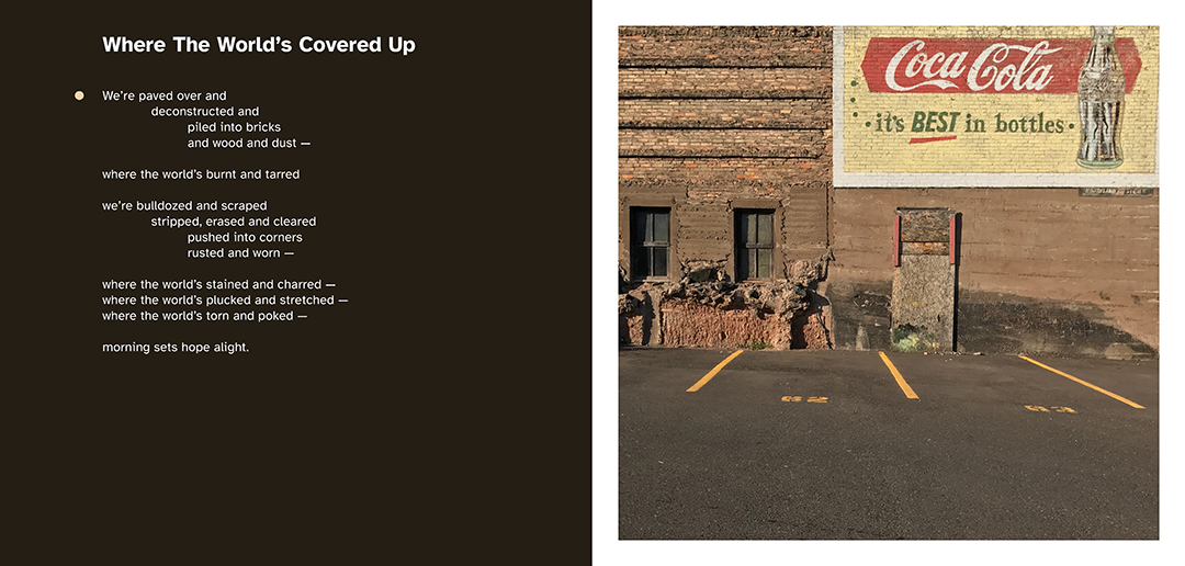
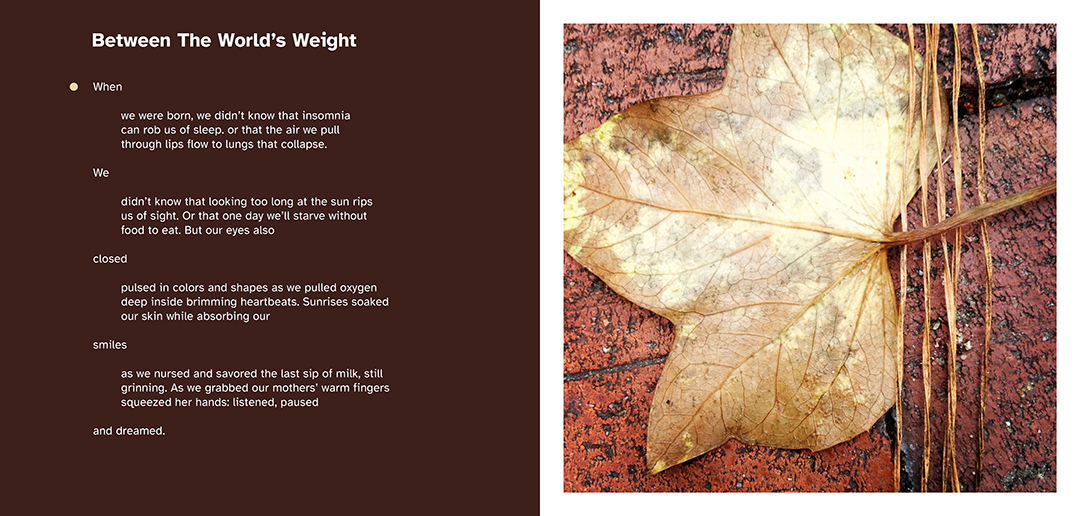
The book will contain a series of ten photographs that I have produced over the last decade. Each photograph in the series shows an object, scene, or landscape in urban environments with similar themes and visual characteristics.
People will be able to experience the photographs by sight and by touch. The photographs will be printed using inks and technology that can capture colors and tactile details of various lines, shapes and textures. Different layers of clear coat varnish are overlaid with great precision on top of each image’s various lines, shapes and textures. The different distinctions between the layers of varnish will make the photographic prints tactile. People can rub their fingers across the photographs to feel and experience them. Regardless of someone’s visual ability, everyone can deepen how they experience a photo once it becomes tactile.
Establishing the distinction between the layers of varnish will make the photographic images more tactile. This process has been challenging due to the print technology’s limitations. However, with every set of printed proofs, everyone involved with the book is learning as we go.
Poems
Deanna has written ten poems specifically to pair with their corresponding prints as another way of experiencing the photographs without relying on sight. Rather than describe the visual elements of the photos, each poem conveys the photo’s vibe and sense of meaning through a unique interpretation.
All content within the book is typeset and formatted using Atkinson Hyperlegible, a typeface that the Braille Institute designed for more excellent legibility and readability for low-vision readers. The typeface achieves this goal by helping people distinguish letterforms and characters from each other. People can read the poems as they feel the photographic prints.
We are also printing the book in Braille, allowing Braille users to experience the book in a manner that fits their needs. The cost to print the text in Braille has been a challenge because it is an expensive process. This feature limits the number of copies we can produce during the first print run. We are attempting to overcome this cost barrier; otherwise, the high cost creates another roadblock for people with low-vision or blindness to experience art.
Research Plans
Usability Testing
The book will soon become a prototype for user testing, enabling us to study how various people with low-vision or blindness use the book. We are excited to learn from their feedback. We are also determined to lower the production cost so we can make more copies of the book, which means more people will have access to art.
Designing a multisensory book experience has been a challenge in all areas. However, we see these challenges as an opportunity to create a new process for making accessible books and media in general. Deanna and I believe that what we are learning can significantly impact how graphic design mediums, especially print and packaging design, can become more accessible for various people.
Speaking and Publishing
I will continue to speak about the book at more conferences. I also aim to write journal articles about the book and the various topics regarding accessibility and multisensory design.
Company
Deanna and I co-founded Color to Sound LLC, a creative arts lab that produces multisensory solutions to meet accessibility objectives in the arts. We will use what we have learned from this book to generate more solutions to address various accessibility barriers in our society. Those projects will lead to more conference presentations and publishing opportunities, in addition to showcasing our work in galleries and museums.
Selecting the Photographs
Deanna and I choose the final ten images after reviewing my portfolio of 1,400 photographs I have produced over the last decade. We selected images of objects, scenes, and landscapes that present a sense of standing still in time while also showing how they may have appeared in the past and what they could look like in the future. We also determined they were good images to make tactile with their rich textures and lines.

Applying the Varnish
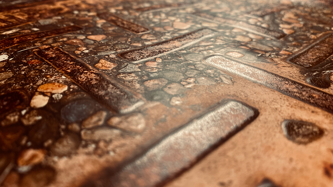
The clear coat varnish will provide two different pathways to experiencing the photographs, one by sight and another by touch. Each photograph is printed with ink on paper. Varnish is then applied on top of specific areas of the photographs. Some areas of the photographs will have one layer of varnish, whereas other parts will have two or three. The distinction between layers creates a tactile texture on top of the photographs that people can feel with their fingers. The tactile textures created by the varnish mimic the textures and lines seen in the photographs.
The photograph of the utility hole has a good contrast of textures and elements to make it a successful tactile print. Overlaying the varnish is most successful with photographs that have diverse visual lines, shapes, and textures. Worth Higgins and I found that the photographs with thin lines and small details do not work well when trying to print with varnish to make tactile images.


Determining Where to Print the Varnish
The photographs are imported into Adobe Illustrator to be traced using the auto-trace feature and manually using the pen tool. The different colors in the Illustrator files indicate where the varnish layers will be overlaid for each image. Determining where to print the varnish on top of the photographs was long and tedious. I adjusted the tracing of the photographs each time I received printed proofs of the photographs.
Bringing the Multisensory Experience to Life
The book is not only being made for people with low-vision or blindness. It is currently being designed to be a multisensory art book experience for anyone who wants to enjoy photography and poetry, regardless of their ability to see. Several design decisions are being executed to bring the multisensory experience to life.
Design of the Front Cover
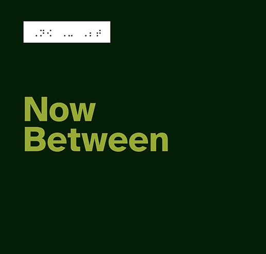
Although this book will be printed, I used the color ratios from the Web Content Accessibility Guidelines (WCAG) to make accessible color choices for the book’s covers and internal pages. The front cover will only contain a flat plane of a deep, dark green and typography formatted in a bright earth-tone green. The contrast ratio between the two greens meets WCAG standards, which will help people read the book’s title. A rectangle will be trimmed on the front cover, enabling the name of the bookmark in Braille to pop through, giving Braille readers quick access to the book’s title. This design decision is more elegant than gluing a Braille sticker with the book’s title on the front cover, which is traditionally how titles of books in Braille are done.
Two Pathways to Reading the Text
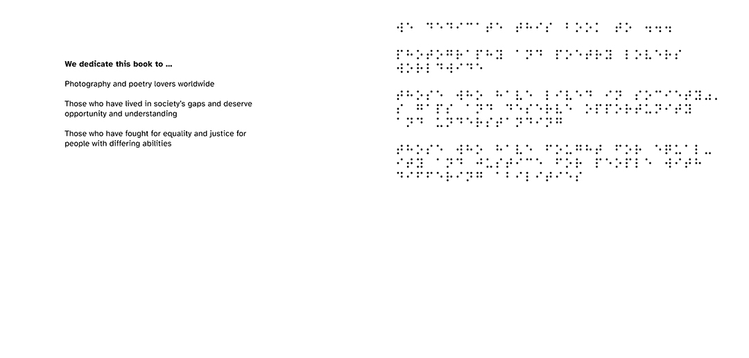
The book’s design offers two pathways for people to read its content by having two versions of the same text. One version is typeset and formatted with ink, and the second version is printed in Braille.



Print Spreads of the Poems and Photographs
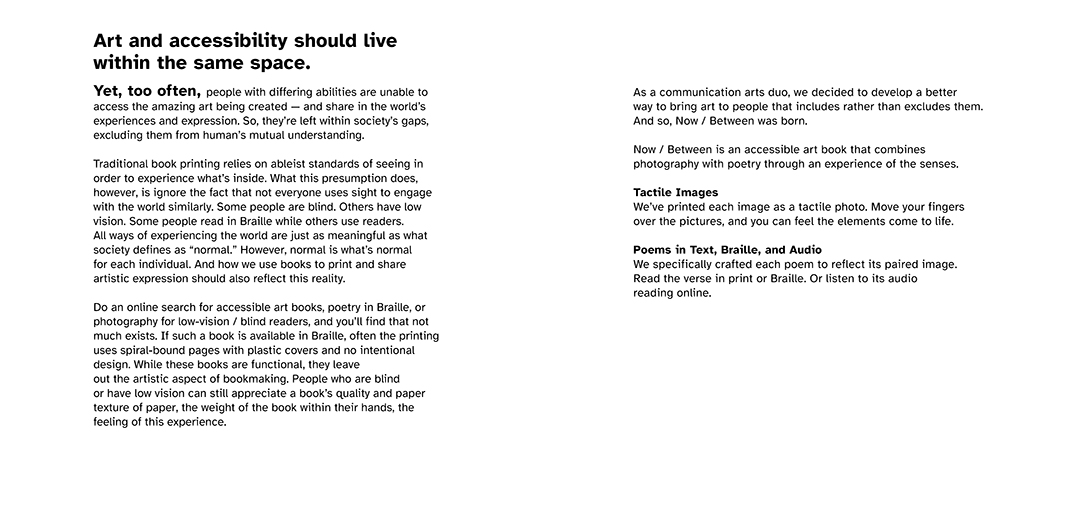
Decisions were made as Deanna and I encountered challenges with the cost of the Braille and layering of the varnish. The print spreads have been the same since the first revisions.


